CakeKraze
A responsive website design that gives a local business a digital storefront.
Role: UX Research & Design
Timeline: 3 months
Tools: Figma, Mural
Overview
CakeKraze is a local small business that specializes in allergen-friendly cakes and cupcakes. It’s business has primarily been driven by social media and word-of-mouth, but the business is growing and the owner is looking to launch a website to increase her web presence and brand awareness.
The Problem
A local specialty bakery needs to expand it’s online presence to match it’s growth plans, and social media platforms aren’t enough.
The Solution
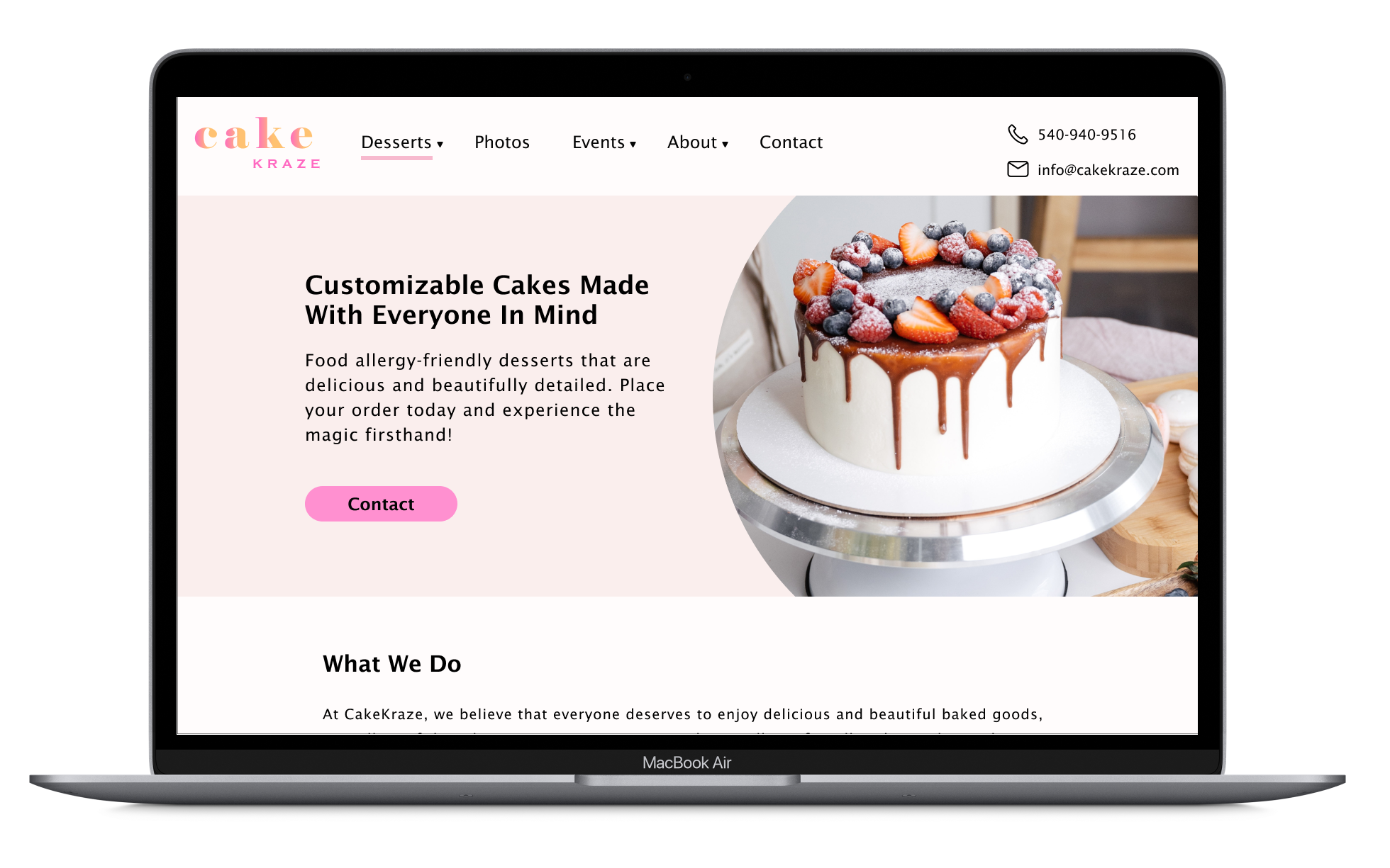
A responsive website that effectively communicates CakeKraze’s value proposition which is: We make customized, allergy-friendly cakes.
My UX Process
Discover
Competitive Analysis
User Interviews
Define
Affinity Mapping
User Personas
Develop
Branding
Feature Roadmap
Sitemapping
Task Flows
Wireframing & Prototyping
Usability & Impression Testing
Deliver
Iterations
Client-Handoff
Discover Phase
Competitive Analysis
A quick look into the local market of bakeries uncovered 2 opportunities for CakeKraze:
There weren’t any bakeries dedicated to allergen-friendly cakes
A responsive web design that adhered to modern UI/UX patterns
The other bakeries already had an established presence in the local market with brick-and-mortar locations, which could be a reason as to why they didn’t have a more modern web designs - they don’t rely as much on their digital presence.
CakeKraze is a small business operating out of the owners’ home, so without having a physical store for customers to visit and shop at, a digital presence will be crucial for the owner’s growth plans.
User Interviews
I interviewed 4 participants virtually via Zoom between the ages of 23 and 31 who had regularly visited and ordered desserts from bakeries or restaurants to understand what was important to them when making a decision for which place to go to and ultimately purchase from.
Basic needs for users when visiting at a bakery’s website included having visually appealing imagery, customer testimonials, and allergy information.
“The visual aspect is a big factor in whether or not I actually want to order from that shop. Like if the product photos aren’t good, I probably won’t order from there”
“I have to order for groups of people every so often, and prefer it for places to have their allergy information listed on their website”
“Before I order from anywhere, I always look up reviews of them. I generally look through them pretty quickly, just looking at qualitative information.”
Define Phase
Affinity Mapping
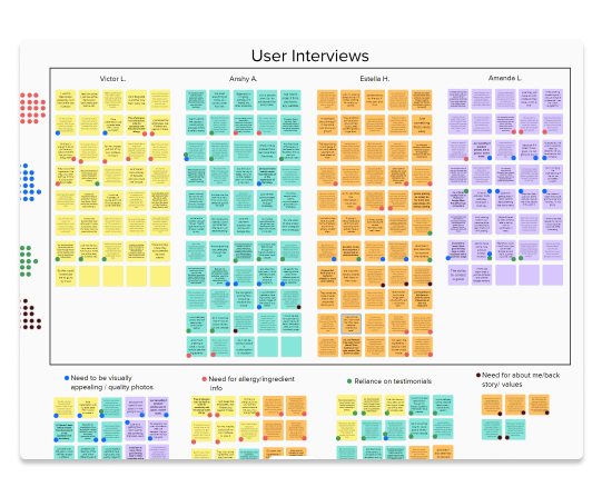
Taking the raw data from user research interviews, I was able to identify common themes and begin thinking about how I could address these with a design that will also fulfill the needs of the clients objectives.
Insight 1 - High-definition desserts
Users expect the website to have visually appealing images of their food and wouldn’t consider ordering from them if they don’t.
Insight 2 - No nuts, no problem!
Users want to see allergy information, especially when ordering for other people or groups.
Insight 3 - Referred by a friend
The majority of users will look at reviews and testimonials by other patrons before deciding where to place an order.
User Personas
Using a combination of insights from the user interviews, and data from the profiles of actual customers’ reviews on the CakeKraze Facebook page (examples below), I created a user persona to help guide design decisions moving forward and ensure I was designing with the users needs in mind.
Develop Phase
Branding
Branding for CakeKraze was an iterative process. Having an existing logo was helpful in creating the brand colors, but I had to make a few tweaks to ensure accessibility (primarily by increasing the colors’ contrast ratio). Using its core values and user persona for reference, I created a style guide that the client will be able to use moving forward for any future marketing efforts or changes with the website.
Feature Set, Task Flows, & Site Map
Based on clients needs and user needs, I began identifying the must-have features for a minimum viable product (MVP), while also keeping in mind features for future implementation based on growth goals of the owner and feasibility. CakeKraze is currently run out of the owners home, so when there’s no physical location for a customer to visit, it was important to highlight product offerings, price ranges, allergen FAQs, and contact information. The owner also has a separate full-time job, so it’s not feasible to accept same-day online orders yet before consulting with the owner first.
I then created task flows for some of the core features of the website that I’d be testing users with, which also helped me as I thought through how information architecture of the site would come together.
Low to High Fidelity Wireframes and Prototyping
Taking the findings from my research, I started sketching low fidelity wireframes for the screens a user might interact with via a desktop, then sketched how those same screens will respond to a mobile device. After receiving feedback for those initial sketches, I mocked up high fidelity versions that I would then use for usability testing.
Impression Testing
I conducted impression tests of the landing page for the website to understand whether my design effectively communicated the CakeKraze brand and value proposition. By giving first-time visitors 20 seconds to quickly scan the landing page and, I was able to learn how the website made them feel and what their initial perceptions were.
Overall, testers described the site with words such as ‘delightful’, ‘appealing’, and ‘happy’, but also thought it was a bit text-heavy and the colors were rather feminine. There was also room for improving how to convey the allergen-friendly aspect of CakeKraze.
Impression Testing Word Cloud
Usability Testing and Findings
I tested my prototype on three users ranging in age between 25-36 years old. The goal for these tests were to confirm whether or not the tasks being tested were clear, to identify any paint points they encountered, and opportunities for improvement. Results from the testing showed that there was a need for a few graphic design iterations that would help make the brand messaging clearer, as well as a restructuring of the product page.
What the users said:
The Good
“I liked the color of the button on top. I think it helped catch my attention. The images are really nice too. Looks tasty!”
“You can tell it’s a small business, and getting in touch with them is really easy…I also like how the allergy information is laid out.”
Pain Points
"I liked the all the colors used but was wondering where all the pink came from. It made me think of Valentine’s Day"
“I’m seeing now that it’s written everywhere, that it’s ‘allergy-friendly’, but it does still somehow get lost”
Deliver Phase
Iterations
Based on feedback from the impression and usability tests, I made a few changes with the imagery and coloring, body copy, on the landing page, an overhaul of the product page, and a few tweaks to the contact form page. For example, I reduced the amount of pink imagery to give less of a feminine/Valentine’s Day ambience, cut down on the amount of body copy in general to make the pages more scannable for the user, and brought to the forefront the “Food allergy-friendly” and “Made-to-Order” aspects of CakeKraze to emphasize the product offering.
Final Prototype
Click through the finished version!
Outcomes & What I Learned
Impression testing for a new business can be extraordinarily helpful
Impression testing was extremely valuable at determining whether or not I was able to communicate CakeKraze’s core brand values. It’s also a very quick method that doesn’t take much time to conduct.
Working within the constraints of no/low-code platform
Luckily, this first version of the CakeKraze website is a true minimum-viable-product, which Squarespace does a good job with. That said, I had to keep in mind the capabilities that the Squarespace platform provides to ensure feasibility of the design.
Would’ve liked to work more with the client on branding
The color palette was a little tricky to address at first and I felt limited working the pinks and yellows provided by the client, primarily from an accessibility standpoint. I would have liked to work with the client a little more on that.
Next Steps
Next steps for CakeKraze is, when they’re ready and have the bandwidth, to make their website via Squarespace (the platform they think they’ll be going with) based on my proposed designs.
Commendation from the client:
”The designs Bret came up with were fantastic! I’m excited to finally have a starting point for how I’d like my website to look” - Amber Shannon, CakeKraze Owner


