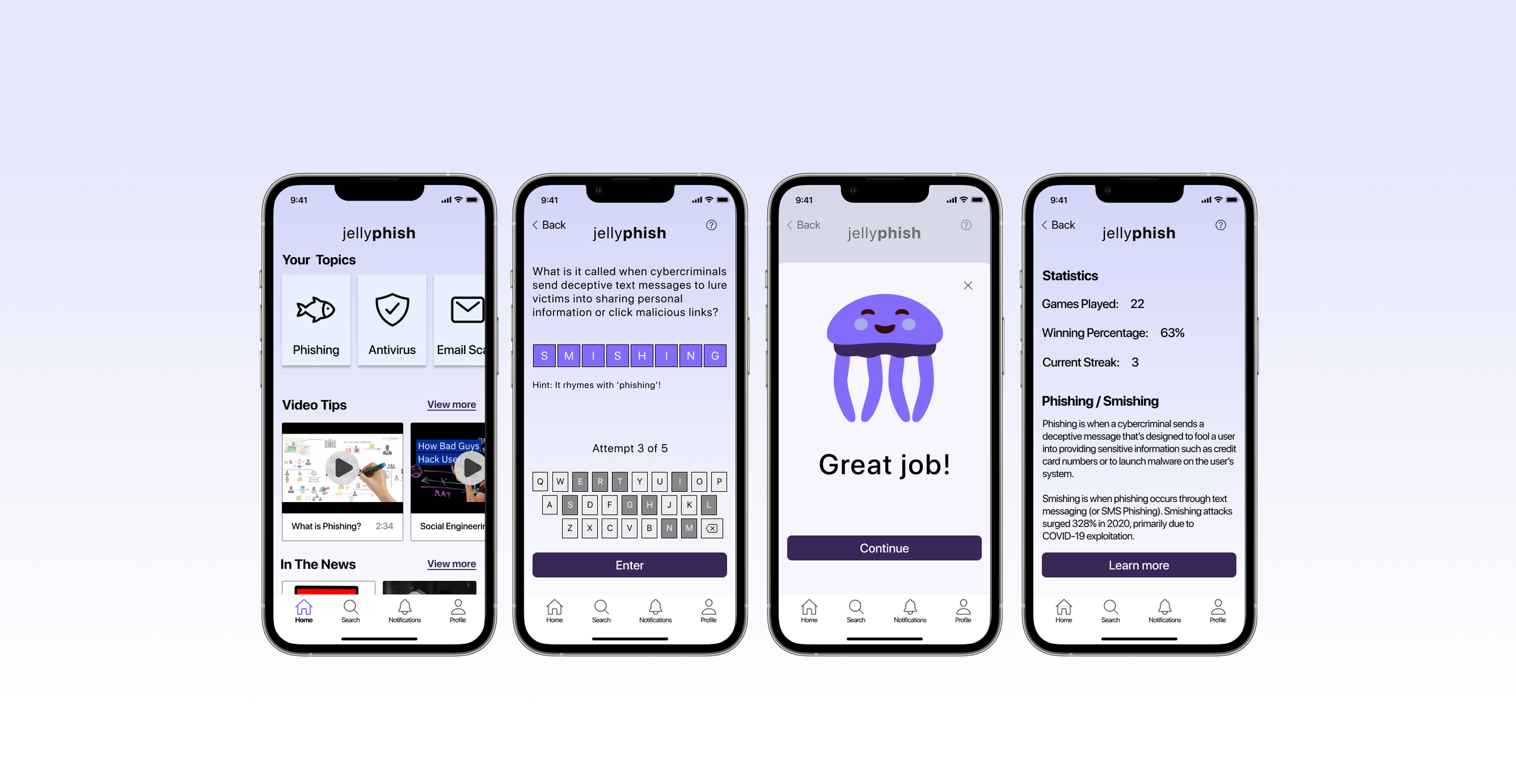
A conceptual iOS mobile app designed to provide internet safety awareness and education for everyone.
Jellyphish
My Role: UX Research & Design
My Tools: Figma, Mural, Maze
Overview
A recent survey by Gallup indicated that more people worry about identity theft and having their personal data hacked than being physically robbed or assaulted. So how can we help educate public on these kinds of threats? While there’s no shortage of cybersecurity training for large enterprises, there aren’t a lot of resources for the normal, everyday person.
How can we build awareness around internet safety for users in a way that’s simple, accessible, digestible, and effective?
The Problem
There’s a massive gap for basic internet safety and cybersecurity awareness in the world that exposes the public to malicious content and vulnerabilities.
The Solution
A mobile app that helps build awareness around internet safety for users in a simple and effective way, to better protect everyday people from digital threats.
My UX Process
Discover
Competitive Analysis
User Interviews
Define
Affinity Mapping
User Personas
Develop
Branding
User & Task Flows
Wireframing & Prototyping
Usability Testing
Deliver
Iterations
Discover Phase
Competitive Analysis
I wanted to see what solution might already exist in today’s market, but the vast majority of internet safety/cybersecurity awareness training services either cater to large organizations, or actually provide an individual user with a technology solution (such as antivirus, personal VPN, firewalls, etc.) to protect their devices. What I found was that nothing seems to focus on building awareness for the individual user.
User Interviews
My goal with user research was to learn what experiences and perceptions people had as it related to internet safety and cybercrime and how. I interviewed 4 participants between the ages of 29 and 64 who had varying levels of digital/internet competency virtually via Zoom. Afterword, it was clear there was an opportunity to help educate users about internet safety.
While the majority of respondents had proactively taken steps to try to protect themselves online (like using multi-factor authentication, keeping social accounts private, etc.), all of them experienced some form of cybercrime, and expressed feelings of helplessness, frustration, and insecurity as a result.
“Did not make me feel good. It made me feel super exposed and vulnerable… it feels like your privacy is taken away and it feels like anyone can do anything without even being [near you]”
“If there was something that had kind of like short explainer videos, that would be really helpful. Like if I just wanted a primer of whatever topic it was…and what to do to protect yourself”
Define Phase
Affinity Mapping
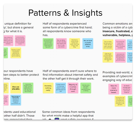
By clustering interview responses that shared common threads, I was able to identify a few core areas to focus on and begin thinking how I might design a tool that will address the users’ biggest pain points.
Insight 1 - Where do I even start?
Half of respondents aren’t sure where to find information about internet safety.
Insight 2 - Layman’s terms, please!
Respondents would learn best with simple and concise methods using layman’s terms.
Insight 3 - So, what’s in it for me?
Providing real-world, scenario-based examples would help engage users more
User Personas
Two user personas emerged from my user research findings that I used to help inform my future design decisions and make sure I kept my users needs top of mind.
Develop Phase
User Flows
Based on user needs uncovered in the interviews, I wanted to ensure that the most prominent features would be as simple as possible to navigate. Creating user flows and task flows helped me visualize the user’s journey and think through the variety of screens I’d have to design and that a user would navigate through. The user flow below, for example, is for playing the daily word game and then going on to learn more about that days’ topic.
Branding
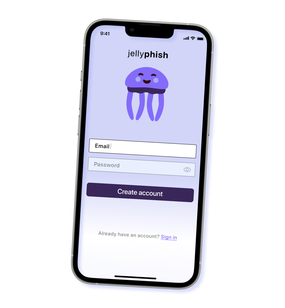
The Jellyphish brand was created with the guiding values of being simple, trustworthy, and effective. While I had a few ideas in mind for the direction I wanted to take the brand, it was an iterative process that came together in conjunction with creating the low-fidelity wireframes.
Low to High Fidelity Wireframes and Prototyping
Based on the user flows I’d previously created, I began sketching a variety of low fidelity wireframes, focusing on the core features that would address the users’ pain points. I then transitioned these sketches into a high fidelity prototype that would be used for usability testing.
Usability Testing and Findings
Due to time constraints, I conducted an unmoderated usability test via Maze. There were 6 respondents ranging in age between 25-50 years old. The goal for these tests were to confirm whether or not the tasks being tested were clear and to identify any paint points. The responses gave me valuable feedback for quick but significant iterations I could make that would enhance the usability of the features tested. Primarily, there needed to be an easier way to navigate to the daily word game, and there needed to be a rearrangement of some of the body copy.
What the users said:
The Good
“I like the consistency of your icons and colors. Very easy, super straight-forward. Nice idea for an app!”
“Clear icons and easy to sign up and pick topics that the user interested in. Excellent topic that is so important.”
Pain Points
"I mainly had trouble navigating to game. I wondering if there would be a game section on main page or icon on navigation bar"
“Struggled to find the daily word game. And the topic page is a bit text-heavy - maybe try to break it up with imagery or something”
Deliver Phase
Iterations
While user feedback from usability testing was positive overall and validated the direction I’d taken, I made a few UI and hierarchical revisions that would ultimately improve navigation and clarity for the user. For example, I wanted to make navigating to the daily word game easier, so I added a button at the bottom of the Home Screen whereas in previous versions this was nested (and subsequently lost to the user) in the Notifications tab. I also reconfigured the placement of the content on the Topic Screen, as the top-half of the screen was a bit text-heavy for users.
Final Prototype
Click through the finished version!
Outcomes & What I Learned
Consider entry points for users when it comes to notifications
I’d created the usability test for playing the daily word game with the assumption the user would be starting from the home page, which caused initial confusion for the user to navigate to the notification prompting them to play the daily word game. Rather, I should have started the usability test from a locked screen state with a pop-up notification on their phone’s home screen which would be a more realistic entry point.
There is a lot of room to run for an app that addresses this issue
I had an inkling that the topic of internet safety awareness might be one with a lot of opportunity and gaps that could be filled, but was surprised to see such uniform feedback from both user interviews and usability tests suggesting a need for a tool like this.
The importance of usability testing
Remember in the user flows section when I said my goal was to make my most prominent features as simple as possible to navigate? Well, it turns out my initial solution for navigating to the daily word game was not so simple after all. The usability tests gave invaluable insight for how it could be improved and for that I’m extremely thankful.
Next Steps
Next steps for Jellyphish include more testing, this time considering the entry point for the notification to play the daily game. I’d also like to explore ways to present a user's gaming statistics in a more visually appealing way. While I didn’t receive any feedback from usability testing that specifically called it out, I feel there’s room for improvement there that could delight users.


